How to Design Packaging For Watercolor Painters
My career just dropped me into packaging 5 years ago as I fell into a production roll at a tech company. As an emerging illustrator, I naturally began to think about illustration and packaging. It goes beyond packaging though. It’s the idea of your work on a product. The materialization of your art on a product is a feeling like no other. It’s your art coming to life.
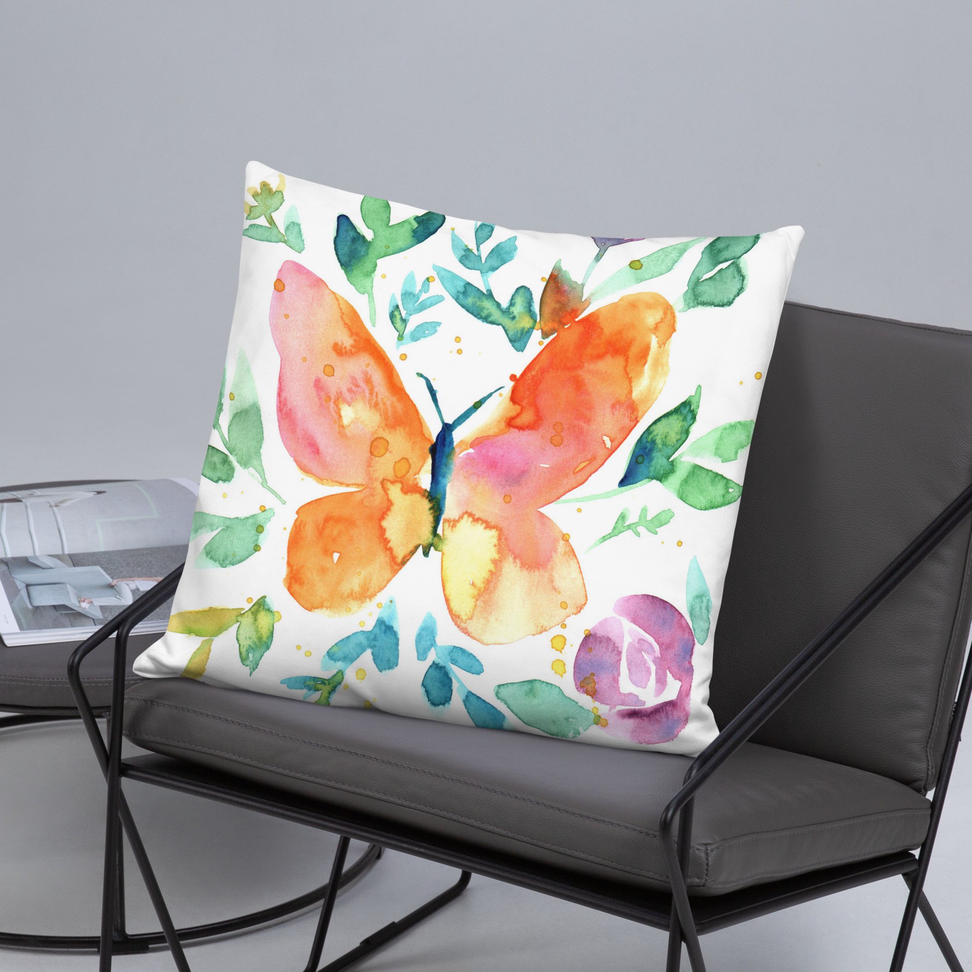
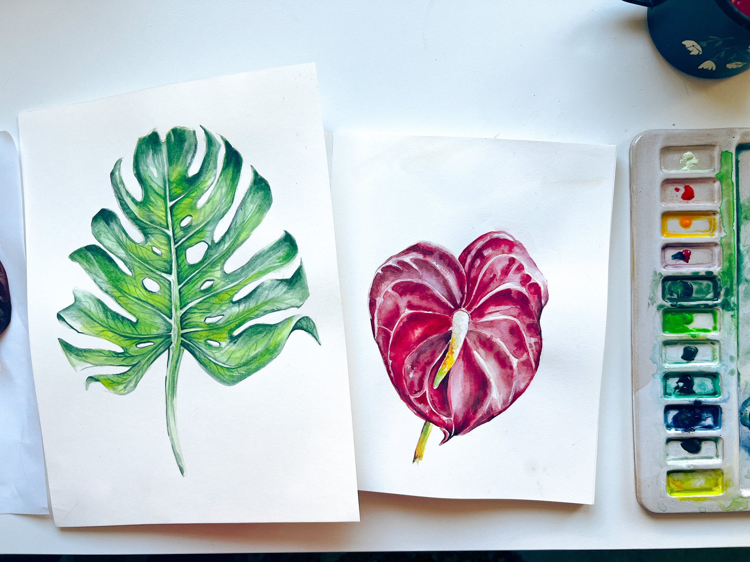
If you are a watercolor painter who wants to design for packaging, I cover some of my tips below for diving into this industry and making your watercolors able to be used. I worked recently on a packaging project that specifically wanted me to use my watercolor painting skills. There is something special about the texture of a watercolor painting that is difficult to achieve in digital art. Some art directors specifically are looking for artists who have digital skills, do watercolor painting, and can adapt their work for packaging.
Watercolor painting for packaging actually involves a lot of other considerations before even creating the art. If you’re a fine artist who paints with watercolor or gouache and wants to branch out into licensing your work or taking on commissions, then this article is a good place to start. There are TONS of courses on the internet about how to digitize a sketch or painting, but a lot of them don’t share the complexities of packaging. In fact, most just go into licensing and sending the art or digitizing and cleaning up the work.
I have been a graphic designer for 15 years and worked on a huge range of projects from branding to interactive media design. I’m sharing below what I have learned while working alongside an art directors on packaging projects and also from running the entire production line of a tech company. Production/packaging is a completely different field and requires an understanding of the printing process.
Maybe recently you’ve had an art director reach out to you to license your work for a packaging project? Or maybe you want to learn how to make your work ready. Here is everything you need to know to get started with designing for packaging.
5 Most Important Things to Design Watercolors for Packaging
When designing art for packaging you’ll want to pick a process that works for you and the person you are going to be handing the art off to. First you’ll need to identify who you are selling your art to. Are you sending it to an art director? Are you licensing it to a big company to put on products? Is this a single run of packaging for one product? Each of these questions determines how you will prepare the files.
Pick a software to make your paintings into vectors.
The first part of this process would involve picking a process to vectorize your art. The reason you need to pick a software to do this is because if you’re working with an art director then you need to know what software they are using and how they want to receive the art. Some ADs will receive art as JPEGs, but most want a vector. Vector simply means the art will not be low resolution/low quality when printed.
The industry standard today is Adobe Illustrator. I personally use Adobe Illustrator. I scan my work on an Epson printer and then bring it into Illustrator to vectorize it. You can also pull the artwork into Photoshop at 300dpi.
Clean up your artwork before sending it to the art director.
I think this part of the process is very important. You can pull the artwork into Photoshop and mask out areas of your painting. I have a lot of pencil sketches in my watercolor art and often I cannot erase them properly. I use the clone tool and eliminate them in Photoshop. If you’re using the masking tool in Photoshop, often parts of the image will come through and then you end up with artifacts that are unwanted. I recommend looking over the Photoshop file before sending it over. I always have areas of the image I need to brush out or get back.
Find out the color palette before starting the project.
This is incredibly important! Don't paint the piece unless you have asked the art director for the color palette or if it is a limited color palette. You could waste a lot of time and energy on an artwork that looks amazing, but has the wrong colors. Things can also be recolored in Photoshop and Illustrator if needed, but your art director may not want to do that.
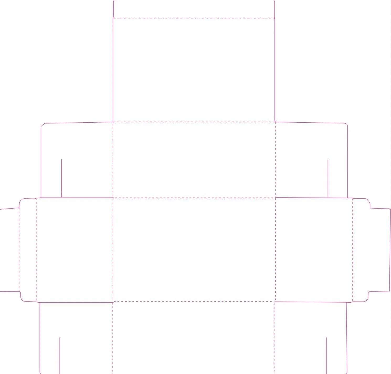
Ask for the dieline of the product.
The dieline is the shape of the product packaging. If you’re working on the packaging for a product then it might be a box, a bag, or a label. Regardless, this box or bag exists as line art in an Illustrator file. Typically packaging looks like flattened line art showing the panels in an exploded view. The dieline will look flat in illustrator and you can drop your art into the areas of the artboard to see how your design will look.
Prepare for revisions by creating your design in layers.
I design everything in layers. Recently, I worked on a project and I painted the background separate, the foreground separate, and each individual part of the product separate. Then the art director could move things around in Photoshop. This is extremely challenging. It’s not how artist’s brains work. We think of our painting as a holistic thing. Everything is process oriented and attached. Especially with watercolors! If you can paint each part of the packaging as a separate element, that will give you a major advantage.
What I mean to say is paint everything on different sheets of paper. Scan them in separately as different JPEGs. Mask out the background or white paper, and then place them all into the same Photoshop file. This is the quickest and most efficient way to provide an art director with the files. They want to be able to move things around or adjust the colors and saturation of different layers.
These are just a few of the considerations for working on packaging. The easier you can make it on an art director, the more likely they are to bring you back for a second project! Packaging requires an understanding of the markings that go on the dieline. These markings are defined by the type of packaging you are working on. For the tech industry, these markings involve warning labels and messaging intended for the buyer when they install the object. It’s best to get the real dieline or preliminary illustrator file in order to see where these markings will be located.
The reason you want to see this is because you are designing art for a full dieline and these markings will cover key areas of the packaging. You can design parts of the packaging to wrap around these markings or look more intentional. It’s also important to note that somethings when text is placed in areas with dark colors you won’t be able to read the text over the art. In a recent project, I made the back panel lighter (mixed more water into my watercolors to lighten them on the paper) in order to make the paragraph on the back readable. I also designed floral elements to go around the logo on the packaging. There are so many fun considerations for designing packaging.
I hope you enjoyed these tips. Sign up to my email newsletter to find out more about packaging, watercolors, and creating.
Feel free to reach out to me if you have any questions about this article. I will be creating a course on designing packaging soon so get on the email list to find out more!


